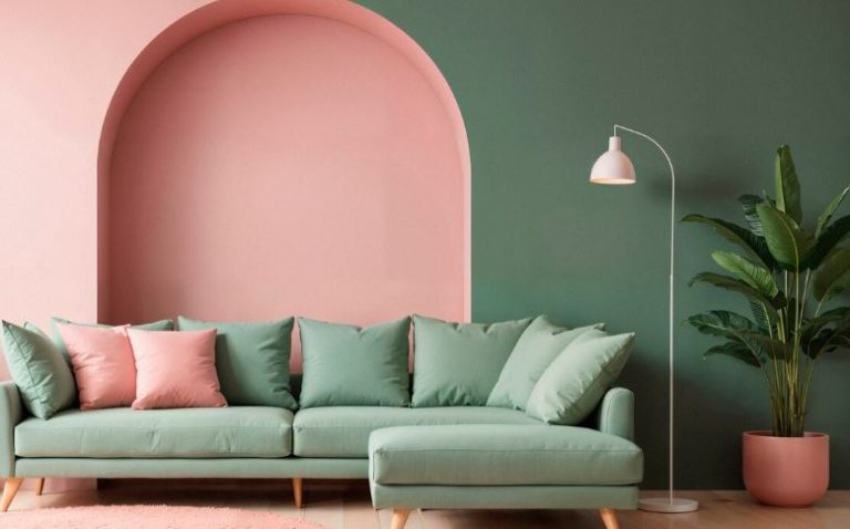
In interior design, color has evolved from a supporting character to a major player in recent years, influencing everything from layout to mood. Soft pink and earthy green have emerged as 2025’s most surprisingly potent combination. Warmth, harmony, and a dash of individualism are what they stand for, not just the fad itself.
Enter Chicago-based artist Alex Hinand, who used a bold yet cozy color scheme to paint his rental apartment with white walls. Like standing in a garden wearing a cashmere sweater, he created a space that was both grounded and airy by combining Vintage Vogue for the fireplace and trim with Benjamin Moore’s Rose Silk for the walls.
Pink Green Living Room Makeover Reference Table
| Design Element | Details |
|---|---|
| Color Scheme | Pink (Rose Silk), Green (Vintage Vogue) – Benjamin Moore |
| Lead Designer | Alex Hinand (@the_bareback_contessa_) |
| Location | Chicago, Illinois |
| Style | Vintage Eclectic with Soft Maximalism |
| Key Features | Hand-brushed fireplace, pink ceiling, secondhand decor |
| Notable Techniques | Painted ceiling, daylight-only painting, high-end brushes |
| Project Tools | Benjamin Moore paints, thrifted furniture |
| Design Goal | Warmth, vibrancy, and expressive comfort |
🎯 Why Pink and Green Make a Very Creative Combination
According to color psychology, green stands for steadiness and tranquility, while pink is frequently associated with healing emotions and nurturing energy. They produce a sensory balance when combined, akin to chamomile tea with a dash of rosé. It’s emotionally intuitive, not just trendy.
Alex emphasized the expanding relationship between design and self-care by utilizing this color scheme. He said, “The colors just made the space feel more like me.” That was important for a space that served as both his haven and his creative studio.
🛠️ A Real-World Design, Not Just for Pinterest
Luxurious brands or glitzy budgets did not finance Alex’s metamorphosis. Instead, it was motivated by passion, hard work, and a lot of Facebook Marketplace magic. He claimed that he had only a coffee table when he first moved in and gradually expanded it using secondhand goods and a clear vision.
Utilizing the existing architecture was what made the makeover so successful. Without adding extraneous details, the mantel and green trim provided visual definition. Because of Chicago’s older apartment stock, the vertical space was initially quite tall and a little overwhelming, but the pink ceiling softened it.
🧠 Ingenious Paint, Ingenious Approach
Practically speaking, this was not a job that could be completed quickly. Alex placed a strong emphasis on painting exclusively during the day so that the true tones could be seen. He also recommended having a small supply of paint on hand in case touch-ups are necessary, which is a very obvious piece of advice for any do-it-yourselfer.
Alex cautioned against it, having previously used inexpensive brushes. He made a joke, saying, “Cheap rollers shed and give your wall an unwanted five o’clock shadow.” Instead, he made an investment in high-quality tools, which resulted in a smoother application and a much more polished final product.
✨ The Individual Touch That Made It All Work
Alex’s use of vintage textures and found objects was one of the makeover’s most endearing features. The space had a life of its own that no catalog could match thanks to the colorful art from thrift stores, mid-century furniture, and even a chrome chair that was rescued from a local alley.
The room was intended to feel purposefully lived in, not to look ostentatious. And that distinction is crucial, particularly in an era of design where storytelling and authenticity are becoming more and more important.
🔮 In the Future: Why Green and Pink Could Become the New Neutrals
Design experts predict that expressive comfort will replace sterile minimalism in the upcoming years. And when pink and green are properly balanced, they provide a very flexible canvas for that development.
From emerald and dusty rose to sage and blush, the range of combinations is incredibly adaptable and reasonably priced to implement. Because of its adaptability, it’s particularly appealing to renters and novice decorators who wish to try different styles without committing to a complete gut renovation.
You Should Use Some Color Therapy in Your Living Room
Color is more than just aesthetics; it’s emotional infrastructure, if that’s the main lesson to be learned from Alex’s transformation. In addition to being aesthetically pleasing, a living room with pink and green is a statement of personality, presence, and tranquility.
These hues say a lot in a time when our homes are more extensions of who we are than ever. This straightforward paint job reminds us that perfection isn’t important in a home, which may be why it feels so revolutionary. Feeling exactly like ourselves is the goal.


