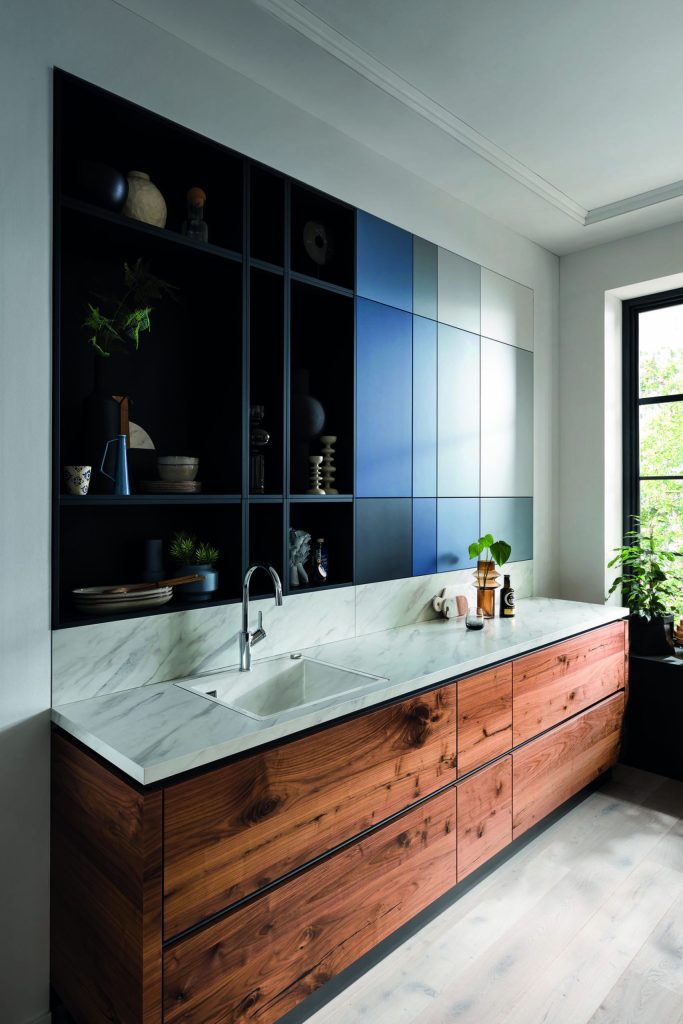
Leading interior design specialists, Brandt Design, shine a light on ‘colour in the kitchen’ as style and application are redefined for a new generation of homeowners.
Albeit extremely personal, colour in the kitchen is now giving way to a variety of new fashion-favourites and this is providing huge scope for contemporary and classic kitchen schemes where colour is helping to create certain types of atmospheres to suit the space and occupant.
To give you the inside track, Julia Steadman, Commercial Director at Brandt Design gives you her advice on the latest must-have kitchen colours, which are defining the UK home in 2022:
PALETTE: High pigment colours are proving most popular right now, with greens and blues being used to modernise the classic kitchen and add depth to more modern schemes. Ultra-matt shades of grey and black are the go-to in sophisticated contemporary kitchens whereas deep shades of plum and indigo blue are elevating raw materials like quartz worktops and brass hardware with a strong base colour.
Try to work with the natural day light too, as this will help to balance cool and warm colours in the room, as well as alter the mood when the space is subject to varying stages of light throughout the day and year. I think we live in a visual age with a much-faster trend cycle than previous generations, which has led to greater interplay between interiors and fashion, and this has definitely led to popular runway colours making a strong impression in the home.
FINISH: The painted kitchen is enjoying a renaissance, as homeowners are enjoying the benefits of rich colour in the latest low VOC paints and textural effect that comes with painted wood grain. Our solid wood Heritage Furniture is a natural partner to leading paint specialists like Farrow & Ball, Little Greene and Mylands. You can also introduce colour on your appliances with the addition of a bold range cooker, or how about a striking splashback or worktop that is designed to coordinate with or contrast against the furniture. For the modernist, ultra matt contemporary colours are being used to absorb the light and provide a modern look and feel, as well as introduce and play with different patterns, prints and colour-blocking for maximum effect.
METHOD: With so many options out there, how do you pick a colour? Given that colour is an integral part of our lives, I think that we are often drawn to certain colours in our clothes home décor, so having an expert’s eye can help you establish what colours suit your kitchen and the direction it faces. For example, if you have a North facing kitchen, the colour grey can look bluer or more purple and it will have a completely different feel to a sunnier South facing room. Having a site visit will allow your designer to factor these outside influences and take inspiration from the rest of your home to be in keeping with your personal style and taste.
Colour has always been a pivotal part of the design conversation, and as the market is increasingly keen to explore how to create the right look and feel at home, it will always come down to the style, layout and finish of furniture when introducing colour in the kitchen.
LIGHTING: Colour is contributing to a greater understanding of how all the elements of a kitchen need to work together for optimum effect and kitchen lighting is a tried and tested way of highlighting the beauty of today’s colour palette. It can also be seamlessly integrated within the latest display furniture so that you can choose a warm or cool light to suit your mood. With so many options, materials and colours to choose from it has never been easier to create a unique tailormade kitchen which will support your family throughout every stage of life.
Property & Development Magazine | The Home of Residential Sector News


