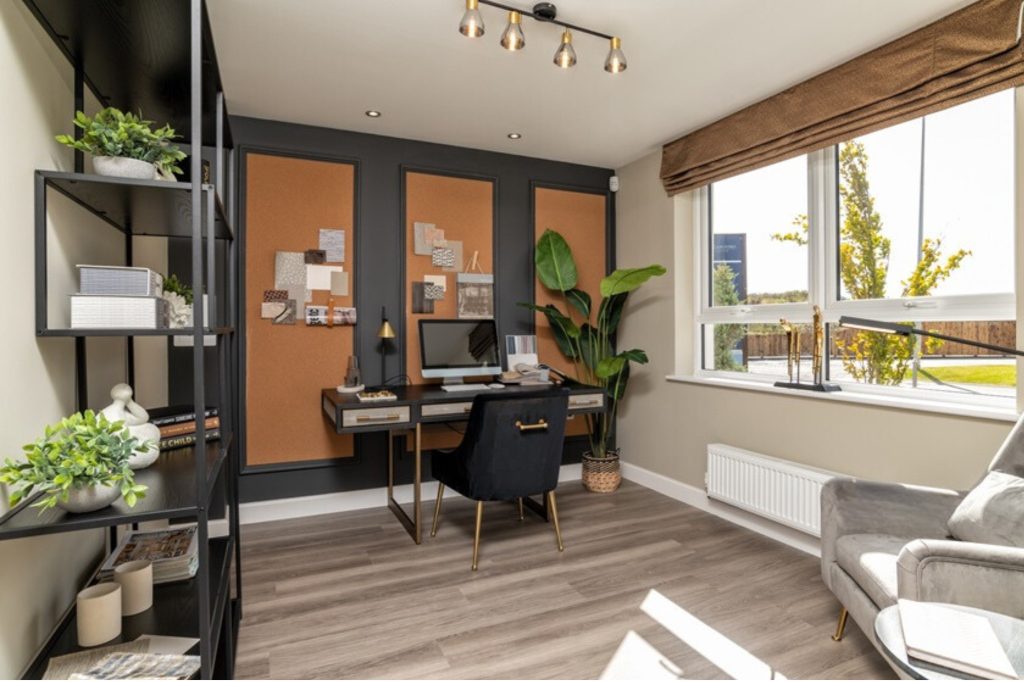
The interior experts behind David Wilson Homes, Show Business Interiors, reveal where this season’s trending colours are best placed in the home.
For those seeking interior design inspiration, David Wilson Homes has teamed up with Show Business Interiors to unveil the leading interior colour palette trends for Summer 2024.
By examining recent Pinterest images showcasing current decor styles in 2024, we pinpointed the trending colours that appeared most prominently and frequently in popular home and interior posts to determine the most sought-after palettes for our homes.
Top colour trends for spring/summer 2024
- Clay Sombre
Clay Sombre, whose notes are reminiscent of the depth and richness of natural clay, emerges as the leading colour trend, appearing in almost half (44%) of the analysed popular Pinterest posts.
The shade’s popularity is reinforced by insights from Behr, a prominent paint and home décor company, highlighting an increasing preference for darker tones, particularly black, in interior design.
For those looking to integrate this shade into their home, Clay Sombre blends seamlessly with dark woods, khaki greens, and warm neutrals. This combination creates a modern yet eclectic aesthetic that aligns with the evolving trends in interior design.
Where does this colour palette fit best within your home?
Alix Riding, Creative Account Manager at Show Business Interiors adds:
“This palette finds its ideal canvas in spaces meant for relaxation and refined gatherings. It enhances the ambience of a cosy living room meant for lounging with loved ones, or perfect for unwinding after a long day.
“Whether it’s on the walls, in the furnishings, or as accents, the warmth of this hue also complements the dining experience, encouraging lively conversations and enhancing the overall aesthetic.”
Complimentary Colours

- Apricot Crush
Ranked as the second most popular hue, appearing in 39% of trending Pinterest posts, Apricot Crush, WGSN & Coloro’s Colour of the Year, features warm tones that evoke the nourishing qualities found in vitamin and antioxidant-rich oranges and apricots.
Bringing a warm luminosity to the home with its soft, sun-bleached quality, Apricot Crush is easily paired with neutrals and will be suitable for textiles, glass, bath and bedroom products.
The gentle and inviting hues of apricots complement the cool and refreshing tones of light blues in a truly captivating way. Together, they create a harmonious colour palette that evokes a sense of tranquillity and balance.
Where does this colour palette fit best within your home?
“Whether it’s the walls of a tranquil bedroom, a vibrant accent in a chic living room, or a refreshing hue in a modern kitchen, Apricot Crush infuses each space with optimism and vitality.
“Embrace this colour to create a space that not only radiates joy but envelops you in a warm embrace every time you step into the room.”
Complimentary Colours

- Violet Cloud
Violet Cloud, drawing inspiration from Pantone’s Pastel Lilac, graces 17% of trending Pinterest posts.
The shade exudes a gentle and velvety appearance, reminiscent of a fragrant scent. When paired with warm neutral tones and a splash of cheerful yellow shades, this colour palette creates a vibrant and nostalgic ambience that will invigorate and uplift your mood.
Where does this colour palette fit best within your home?
“This hue brings a sense of tranquillity to bedrooms, a touch of sophistication to living rooms, and encourages creativity in home offices.
“Whether in soft accents or as a bold statement, Violet Cloud invites you to embrace a world of calm and creativity, making every room a sanctuary of inspiration.”
Complimentary Colours

- Bleu Profond
Inspired by Benjamin Moore’s 2024 Colour of the Year, ‘Blue Nova’, this shade graces 12% of trending Pinterest visuals.
This unique mid-tone shade represents a perfect harmony of depth and intrigue, revealing a stunning duality that is both timeless and modern. This vibrant hue exudes a lively and dynamic energy that perfectly complements the tranquil, soothing effect of cool, light neutrals. When paired with shades of green, it creates a harmonious and refreshing atmosphere.
Where does this colour palette fit best within your home?
“From the walls of a cosy reading nook to the ambience of a dining area or the serene backdrop of a bedroom, Bleu Profond represents both sophistication and tranquillity.
“Dive into the depths of this colour to create a space that captivates the soul, turning every room into a sanctuary of elegance and peace.”
Complimentary Colours


